The Divine Comedy
 This is just a selection of Neil Packer’s illustrations for the Inferno part of Dante’s Divine Comedy, commissioned by the Folio Society. You can see more here, including a short film.
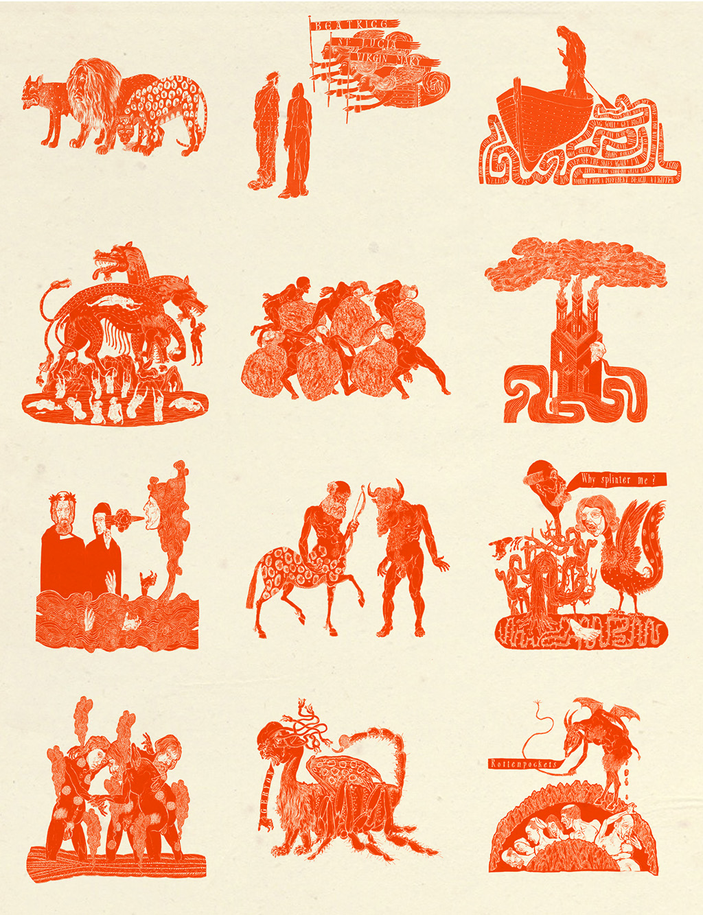
And here, in the article on publication of the limited edition of The Divine Comedy, first printed in the Folio Society Magazine, Spring 2021
‘Love, death, belief: there are no bigger themes than those explored in Dante’s The Divine Comedy, a classic of Italian literature which continues to be loved by readers all over the world. Of its time, and also timeless, and with phrases so perfect they have long since passed into language itself – ‘abandon hope all ye who enter here’ – it is dense with symbolism, metaphor and allusion. When Folio decided to mark the 700th year since the death of Dante Alighieri with a special limited edition of his masterpiece, it had to be unlike anything else.
‘As T. S. Eliot said, Dante and Shakespeare divide the world between them: there is no third,’ says Tom Walker, editor on the project. ‘The Divine Comedy is one of the world’s great poems. What we always hope to do with Folio editions is to renew such books and give the reader a fresh experience.’
‘That experience began to take shape two years ago, when Walker first considered who might be able to take on the task of illustrating The Divine Comedy – and thought immediately of Neil Packer. Packer has an impressive body of Folio work behind him, from Catch 22 to Foucault’s Pendulum. But, says Walker, he also possesses an intelligence which echoes Dante’s, and a natural sympathy with Dante’s medieval world.
‘Packer didn’t think twice before committing. ‘It is a monumental work that embraces metaphysics, philosophy, science – and everything in between,’ he says. ‘All the human condition is woven into it. I knew that this was going to be a challenging and profound process, but one of the great joys of illustrating any book is that you have the luxury of getting to know it and understand it.’
‘The work is made up of three books – Inferno (Hell), Purgatorio (Purgatory) and Paradiso (Paradise). Each book contains 33 cantos, with the introductory canto to the entire work usually counted as the 100th. In the Folio edition, each of the 100 cantos has its own illustration, while three stunning limited-edition prints in a folder printed with a marbled design represent each book.
‘Packer felt strongly that the illustrations should bring out something new in the text, rather than attempting to show what Dante is describing. ‘That architecture of Heaven and Hell is beautifully realised in the poem and in the reader’s head. Sometimes it’s the illustrator’s job to remember that the reader conjures up better images than us.’
‘Instead, he considered the primary and secondary themes of each canto and asked himself: is Dante referring to something else other than what might first appear? (The answer is almost always yes.) Should the illustrations be an exact replica of what he is reporting? Or do they need to point into his mind or outwards to the real world? And, most importantly, what would work best visually?
‘In canto 27, for example, Dante refers to the ‘brazen bull’ – a life-size bronze cast of a bull that was used as an ingenious torture device. A man was locked inside the bull, a fire was lit underneath, and the man’s screams would echo up through the bronze statue’s throat, like the roar of a bull, as he was slowly roasted to death. ‘This was a real thing, in the real world,’ says Packer. ‘So, it made for a very powerful and horrifying image.’
‘In a quest to ensure that each illustration was different, Packer drew upon diverse influences. ‘I started with medieval woodblock prints, because there is nothing more unsettling than a medieval woodblock print! But I also took in English woodblock prints from the 1930s, North African designs, 18th- and 19th-century steelpoint engravings, Dürer, and beautiful medieval diagrams of the planets and their epicycles, that are like medieval spirograph drawings.’ Then, of course, there were all the finishing touches: the hand-drawn title page and labels, and the text that runs around the edges of the books themselves, all using Packer’s own typeface – which he has yet to name but is, he says, based on medieval texts ‘with a bit of Art Deco thrown in’.
‘While Packer worked on the illustrations, Mattia Galliera, project manager at fine book binder L.E.G.O. in Vincenza, Italy, was devising the best way to present the work, in close collaboration with Folio’s team. The result was both gloriously simple and incredibly complex to devise: a case with two drawers and a recess, allowing the books to be presented vertically.
‘The drawers went through many iterations before the perfect design was found – light, yet strong enough to hold three heavy books. At each stage, new challenges appeared meaning that every detail had to be very carefully thought through. ‘Each drawer is printed inside with a different design for each book, and each book is bound in leather, so we chose a paper called Tula, which has a vintage effect, and laminated it to ensure the highest quality of presentation,’ explains Galliera.
‘Each book has its own colour scheme, but the three predominant colours – orange, Paynes grey and blue – are used throughout the case, giving a sense of cohesion to the whole while still maintaining the separate character of the books. ‘The laid Corolla paper, the textured grain of the Duo cloth chosen to cover the case, the colours, the raised bands on the leather spines – they all combine to make you feel that you are looking not at a modern production but a glorious, prestigious ancient artefact,’ says Galliera. ‘I cannot begin to say how proud and honoured I was to produce this Italian masterpiece, which I studied in high school in the old Florence language, for an English audience.’
‘Pictures, design, text: appropriately for numerology-obsessed Dante, all three come together perfectly in this extraordinary work. ‘Our limited editions programme is going from strength to strength,’ says Walker. ‘The inventiveness of the design, the ambition to take classics and give them a contemporary twist, and the ingeniousness of the illustrators who take on these vast projects -this edition is the perfect example of what Folio is trying to achieve with our publishing.’